Showing posts with label Charleston SC. Show all posts

Saturday, March 23, 2013

Pier Sketching

I sat under the shelter at the end of the pier at Shem Creek Park, watching people come and go,
kids run and play, fishermen (and women) fishing, gulls flying and people just enjoying each other and the lovely weekend weather in Charleston SC.

Here is a sampling of the people that I watched.

Lots of kids, women with buns and fisher-women.


This man fished all day long without catching anything.
That, my friend, is dedication.
(or as he said "It's just what a fisherman does.")

Pardon the shadow on the page.
I scanned the page and the book is getting
pretty full.
As you can see, everyone was looking out to the Harbor. I was sitting behind them looking the same way.
Nothing like spending a day listening to the birds, looking at the ocean and doing some urban sketching.

Thursday, March 21, 2013

Charleston Pier Sketching

I had the pleasure of going to Charleston SC this past weekend with my husband.
He was busy umpiring a baseball game so I had a little free time on my hands.

I wandered over to Shem Creek Park (in Mt. Pleasant) to do a little walking, people watching, meditating with Nature and sketching.

I made a book a while back that I call "The Charleston Book".
I try to carry it with me every time that we go to Charleston. I journal, sketch or add little bits of ephemera that catch my fancy.

"The Green Fan"
Robert Henri

I used heavy decorator textiles on the cover
to make it nice and thick.


I love the image in the front of the book. It's "The Green Fan" oil painting by Robert Henri.
Gibbs Art Museum in Charleston owns the original and it is truly spectacular.
It measures 41" x 33".
It is one of my favorite paintings.
I printed it on a nubby fabric (old curtain sheers from my mom's house) so it gives the cover an old time-worn look.
I used several scrapes of heavy decorator fabric that really gives the cover a nice heft to it.Hand dyed vintage lace for the spine.
The back cover is a truly handmade concoction of mine.
It looks and feels like leather but is a mixture of molding paste, acrylic gels and acrylic paint.
It is not only supple and flexible but it is sturdy enough to travel with me as I wander about.


I dyed a batch of vintage lace that belonged to my grandmother and used it as an embellishment for the spine.
I had a few yards of this beautiful green waxed linen thread that I stitched the signatures into the book with.


Next time I will show you the sketches that I did while wandering around on Shem Creek.

Sunday, December 2, 2012

December Already?!

Really, is it already December??
November was a blur of activity for me.
It seemed that I had just got back from New York (to open the "8 That Create" group show) and it was time to fly to Colorado for a couple of fun happenings.

Oh wait - I forgot the week that I spent in Charleston between the two events...

Okay so I got back from New York,  unpacked my things, did laundry and repacked to travel to Charleston SC - where the weather was much different than upstate NY (thank goodness).

My husband and I spent several days riding our bikes around the city, visiting favorite restaurants,  wandering around at semi-secret coastal estates and visiting our favorite galleries (look at this place - Robert Lange Studios) (there is a reason that it was voted Charleston's Favorite Gallery several years in a row!).
I love the gallery director Carrie.
Every time we go there, she walks around with us, talking about each artist and their work. This makes each piece so much more meaningful - knowing the stories behind each one.
I love all the artists there.
I would love to have my art work hanging in that studio one day.
I'd love a solo show there (that's for you, Universe).

We went to Botany Bay (Edisto Island wildlife preserve).
If you're ever close to this place, you should take the time to go there.
Take your camera too.
It's a visual feast for sure.


It is a beautiful section of land that is being preserved for future generations by the state of South Carolina.
It is truly spectacular.

Stay tuned for more November adventure stories soon.


Wednesday, May 16, 2012

A Different Kind of Class

I love Charleston.
Especially before it gets all hot and horribly muggy (even though it's still beautiful to me then).
This past weekend, my husband and I went there (part business and part pleasure).

I taught a class at my friend Cathy Buck's shop "Fashion Fabrics" in Mt. Pleasant.

What a great class!

It was a class in embellishing an  infant onesie or a kids tee shirt.
It's an idea that I got after reading Natalie Chanin's first book.
Here's a sample of one of the class projects -


Or this one.
The model (my nieces son Caden) is so cute!


This is another cute model, Kennedy (another nieces baby). I love the way that her mom coordinated her accessories!


Here's a shot of  some of the class hard at work.


The class was three hours long and everyone did a great job.
We did some screen printing, painting on fabric and reverse applique.
We also recycled some tee shirts and talked about sustainable clothing.
It's a great way to learn a little hand stitching too.

I love the way that this class allows women to gather and spend time doing what women do...talking, sharing information & ideas, creating beautiful things for our loved ones and honoring our creativity.
We are doers, makers.

If you're in the Charleston area, stop by Cathy's shop.
It's called "Fashion Fabrics".
She carries Bernina's, quilt fabric, apparel fabric, notions, ribbons and all sorts of goodies.
She also offers a wide array of classes, a few clubs and sewing machine work as well.
I think it's about the only place in the Charleston area that you can find quality fabrics. Oh, you can find the cheaper fabric but not the good stuff.
The address is 320 W. Coleman Blvd, Mt. Pleasant SC 29464.
Shop number is (843)884-5266.

Tell her that I sent you.

Now get out there and Do Something.
Create.
Make.

Thursday, November 17, 2011

Door Knockers

On a recent trip to Charleston, I spent some time looking around at the beautiful and ornate door knockers.
I'm always amazed at the decorative touches that people put on their homes in the city.
You will find rich and tasteful (as well as gaudy and flashy) ornamentation in the smallest of places here.

I took the time to sketch out a door knocker at 1 Legare Street.
I used a photograph for reference later as I added a little bit of watercolor to the sketch.


Have you stretched your creative muscles today?

Wednesday, November 2, 2011

Rainbow Row

I've been reading about the history of Charleston SC lately.
I love the book by Diane Hollingworth Gessler called "Very Charleston".


It's a beautifully illustrated book, just full of watercolor paintings by the author.
I couldn't help but paint one of my own based on her interpretation.

It's a quick watercolor with details sketched in with India Ink. My painting is almost identical to the one in the book but it really helped me to do this one before trying another on my own...it was a great way to loosen up and get the perspective right.
I am not (by any means) a watercolor painter so I needed all the help that I could get.
I have a ton of ephemera that I've collected from Charleston and I want to construct my own "Charleston" book so that I can include all my treasures.

Don't forget to check out the new theme on the "Sketchbook Challenge" blog this month!
Carla Sonheim picked this time.
Check it out, play along, win prizes!

Sunday, October 2, 2011

October Theme

This is a repost from the "Sketchbook Challenge" blog.
Original post here.


Carol here, welcoming you to October.

A month that brings many changes to my Southeastern US landscape... the days become shorter and temperatures drop cuing leaves to change color and fall off the trees, gardens mature with their harvest and are tilled under signaling their rest period.

Here in the South Carolina we are getting a much deserved break from the relentless humidity that we have suffered through this summer.

My husband and I kayak in the local rivers and can often be found tromping through the forest on any given trip...we're noticing things now that we didn't see all summer – whether it's the changing of the leaf color or the filtered light through the trees – our landscape is changing...

Which brings me to the theme for this month.

The theme for October is VIEW

View/Views

noun

1. An instance of seeing or beholding; visual inspection
2. sight; vision
3. range of sight or vision
4. a sight or prospect of a landscape, the sea, etc
5. a picture or photograph of something

My suggestion would be to look the word up in a couple of different dictionaries (here, here, or here), check out the synonyms and see how it is used in a sentence.

This is what I usually do...but I can get rather intense from time to time. The research phase is one of my favorite parts when beginning a new project.

I am choosing to begin the month with a more literal interpretation of the word.

If you're been reading this blog (here and here) and my personal blog, you'll know that I've been doing a bit of (much needed) work in my bathroom.

I purchased and altered a shower curtain, which by the way, turned out very nice. Now I'm painting a triptych for an empty space on the wall.

I knew that I wanted a landscape painting. I wanted bold, bright colors (aren't you proud of me Kelli?) that would just jump off the wall. I also wanted to try out an idea I had about the house paintings that I had been doing.

So the first step in my “journey with a view” was my trusty sketchbook.

************************************************************

You know, we've all been so brave this year in sharing our sketchbooks.
I don't know about all of you loyal readers but there are marks in my book that are, um, less that stellar. As a matter of fact, they are almost pitiful! But there is one thing that I have learned in this Sketchbook Challenge journey, it's that we all make marks like that. We all have room to grow and improve. And when you share your bad marks along with your good marks, people connect with you on a different level.
That view is the same for all of us, isn't it?

***********************************************
Kinda got off topic, didn't I?

Anyway...

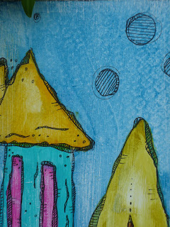
I started painting a series of houses and landscapes last year called “It Takes A Village”. I envisioned a village of wonky skinny houses that had tall skinny trees and odd skinny flowers in the garden.

I fell in love with the whole project and I am still painting them a year later. I wanted to take that idea up a notch with this triptych.

I sketched out my idea – which was to have the painting flow through three separate panels of wood (my substrate).

This was my first idea (sorry, I didn't scan it before I painted it).


I also used this page ( Moleskine Folio Sketchbook A4 ) to try out several different colors of paint. I have to jot down the name of the color or I will forget it. I was using the Derwent Intense Watercolor pencils on this page.
I liked what I had on this page – it was bold and colorful, it was in keeping with the “It Takes A Village” series...but something just wasn't clicking with me.
I really wanted to let my wonky little houses grow up a little bit.
I began thinking of how I loved the “Rainbow Row” houses in my beloved Charleston SC. I decided to look at some images pertaining to that type of structure.
When I begin a project or get stuck with one, I often turn to Google for help. I click on “images” at the upper left hand corner of the main page and type in what I looking for. The returns are usually pages and pages of images to calm or confuse you.
In this case, I found just enough to get me going in a different direction.

I went back to my sketchbook.
These pages are a sample of what I sketched out after my Google search.


I really liked a couple of the houses this time and began another “test” painting.
This is what I came up with (again, I didn't scan before I began painting).


I laid out the landscape as one continuous scene, then drew the lines in to separate it into the triptych panels.
You will also see the smears of red paint on the left hand side. I was trying to make up my mind about which color to paint the houses. You will later see that I used almost every one of the colors in my shading.
I also added a bit of the ocean to the background in the "real" painting.
The scene is a compilation of views that we have when kayaking in the Charleston Harbor.

I used a bit of artistic liberty but that's what we do, right?
I'll give you a tiny peek at how the painting is progressing. Throughout the month, I'll post updates and let you see how it's going.
I hope that you will enjoy a small view of the work that started in my sketchbook this month.
Please share yours as well!

The theme for October is VIEW

How to be eligible for prize drawings:

In order to be eligible for one of the October prize packages you must post at least one photo of a sketchbook page related to the October theme to the Sketchbook Challenge Flickr group and you MUST tag one of your photos with the code "oct489".
IMPORTANT: PLEASE ONLY TAG ONE OF YOUR PHOTOS with this special code!
It is not necessary to tag more than one and it will not increase your chances of winning.

Information on how to upload photos to flickr can be found
here.

Winners will be chosen based on random draw on 10/31/11 and announced on the Sketchbook Challenge blog either on that day or on 11/1/11.

Thursday, July 7, 2011

Etsy Update

I am wondering why time seems to pass so quickly these days?
Or perhaps it's just me, being in a fog...allowing the days to slip by me...

Either way, I've looked up and it's July 7 already!

I am posting original works of art in my Etsy shop.
If you see anything that you're interested in, let me know!
I am also beginning to work on another series of these wonky little houses based on buildings in Greenville SC (I live near there).
I'd love to do some of Charleston SC as well!

Here's a photo of the first one that I have listed in the "It Takes A Village" series.


I paint them first and then add a ton of tiny little details with India Ink.
Most of them are painted on scraps of different pieces of wood or laminate but the last two have been painted on MDF board as it's resistant to warping or splintering...plus it's a recycled product as well.
I love painting these pieces! They are so fun and everyone seems to really like them.
They would be really cute in a kids room...but I've sold several to women that want to put them where they can see them - they say the work makes them smile.

And I do like to make people smile.

Hope you're having a lovely day.
I think I'll go out and ride my new (used) bike today!